User Interface (UI) and User Experience (UX) design is hard, no doubt about it. Sadly, many software applications appear to have been built by narcissists, because they seem to assume that:
- We enjoy being constantly interrupted by them
- We love to repeatedly try out every feature available they have, including things we will never need
- We believe it’s worth spending hours re-wiring our brains to deal with their unconventional design choices
How do you know if your application is just as vain? Here are 3 signs of design narcissism:
1. Being Too Noisy
Imagine you hired a babysitter who called you every few minutes during your night out to say:
“Hey, everything is OK! I’m still here and everything is fine! I’ll be calling back every 2 minutes whether you want me to or not! Bye!”
Nobody in their right mind would be happy with that kind of nuisance, but many software applications behave similarly. We somehow convince ourselves that it’s normal, and we put up with it. We even let it cause us some major embarrassment.
Applications with a singular purpose (for example, automatic backup programs) have historically been built by developers who felt they had to repeatedly show the value of that one feature to you. So every time they successfully performed their only important task, they would notify you. They would scream over emails and dialog boxes: “Hey I just backed up your files for the 3,716th straight hour!” That’s the narcissistic approach, and it assumes that the user wants to hear that noise on a regular basis.
And of course, no customer wants to hear it. There’s no value in telling users that nothing is wrong and that the application is working just fine. Instead, they want to hear about things that are not typical. They want to be told about events that require immediate attention.
For example:
| Application | Please Interrupt Me If… |
Don’t Interrupt Me If… |
| Outlook | I have an upcoming meeting | There are new emails in my Inbox |
| Skype | Someone is calling me | One of my contacts has a birthday |
| Anti-Virus | A virus was detected | A routine scan was started |
| Web Browser | I’m browsing a phishing site | I can upgrade to a new version |
| Music Player | Never, I’ll notice if the music stops | Ever |
DropBox is an application that is not narcissistic. It knows not to bother me, and I love that about it. It sits very quietly in my Mac’s status bar, its tiny logo remaining unobtrusive and its noise levels almost at zero. When I save a file to my DropBox folder, it quite happily synchronizes it without requiring any clicks, acknowledgments or action on my part. When it’s finished, it doesn’t presume that I am waiting with bated breath for the final confirmation of success, so it stays quiet. If I really need some reassurance that it is healthy then I can make the choice to look for the “green tick” on the icon.
Microsoft has also been doing better with reducing interruptions recently. Their latest versions of Office have drastically reduced the number of annoying “informational” message boxes shown to the user, but they still have a few more to go.
A user’s attention should be considered valuable, and any software that tries to grab more of their brain’s time than it deserves will likely be quickly uninstalled.
2. Being Too Helpful
It’s impossible for every single feature in an application to also be the most important one for the user to select. However, most software gives every feature similar amounts of real estate on your screen, regardless of their relative importance. A good example of this is in Microsoft Excel’s toolbar (click the image to enlarge):
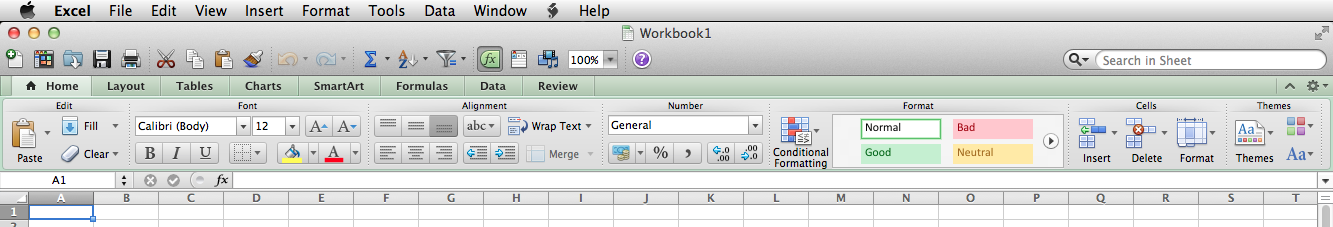
It’s basically a “Where’s Waldo?” of features. Since I’m not a financial professional, I never use most of these features. It always takes me far too long to find the “Σ” symbol to sum up data, and that’s because it’s right next to icons for completely unrelated things like Copy, Paste and Undo.
The importance of different features changes over time for each user. Wouldn’t it be nice if an application were smart enough to hide icons from you if you hadn’t used them in a few months? I’d also love to see an application react to the way I use its features. For example, I always use keyboard commands to Copy and Paste, so I would love if my applications would automatically realize that and would just make those wasted icons disappear and give more room to the things I’m working on.
Many developers try to meet everyone’s needs partially but end up meeting no one’s completely. Users are usually faced with the results of design-by-committee interfaces that never seem to meet the needs of each individual. It’s like trying to order a meal at a restaurant that has far too many things on its menu from a waiter who never stops offering suggestions. Time and time again, customers must adapt to the application’s need to offer them every possible option all the time, when all they want is the same dinner they ordered the last twenty times. If you take all users across your install base, chances are every feature is used by someone. But that shouldn’t mean that every user needs to see every feature.
So, before any more Paperclip Assistants are conceived, let’s make sure the software world knows that their customers just want to get their work done, not to have vast numbers of irrelevant features presented to them on a never-ending basis.
3. Being Too Different
Narcissistic software developers will regularly assume that users will be happy to use an application that completely disregards UI design conventions and interaction guidelines. This is usually done to make an application really “stand out,” but in reality the developer’s vanity often makes their application unusable.
There are plenty of examples of terrible user interfaces to be found. One thing they all share is a complete disregard for consistency with established standards. Making a user re-learn how to perform basic operations would normally be a recipe for the application’s total failure in the marketplace, but some lucky products lack any competition, leaving the user no alternative. For example, most of the peripheral hardware devices that I’ve purchased over the years (sound cards, printers, etc) came with proprietary software that look like they were designed as an April Fool’s prank (click the image to enlarge):

Developers should have the humility to respect established UI and UX standards unless they can truly show significant value by breaking the mold. But be prepared for an initial backlash if you don’t manage that change well enough.
So, to every software developer out there: remember, if there’s anyone who has a right to be a narcissist when it comes to UI design, it’s not you, but rather the user.
